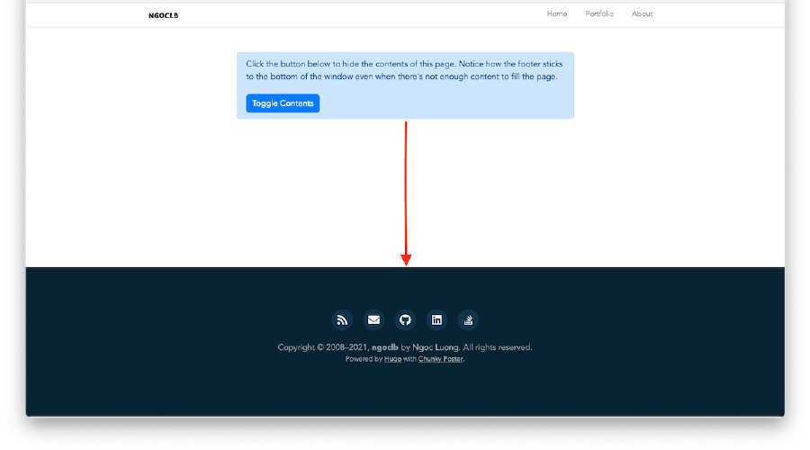
Getting the footer to stick to the bottom of pages with sparse content is something just about every Web developer has tried to tackle at some point in his or her career. And, for the most part, it’s a solved problem. Yet all the existing solutions have one significant shortcoming — they don’t work if the height of your footer is unknown.
Click the button below to hide the contents of this page. Notice how the footer sticks to the bottom of the window even when there's not enough content to fill the page.
Flexbox is a perfect fit for this type of problem. While mostly known for laying out content in the horizontal direction, Flexbox actually works just as well for vertical layout problems. All you have to do is wrap the vertical sections in a flex container and choose which ones you want to expand. They’ll automatically take up all the available space in their container.
In the example below, the container is set to the height of the window, and the content area is told to expand as needed. (Note: in the vertical direction you need to specify a height for the container. This is different from the horizontal direction, which automatically expands to fit.)
The HTML
<body class="Site">
  <header>…</header>
  <main class="Site-content">…</main>
  <footer>…</footer>
</body>
The CSS
.Site {
  display: flex;
  min-height: 100vh;
  flex-direction: column;
}

.Site-content {
  flex: 1;
}
View the full source for the Site component used in this demo on Github.
Note: the CSS required to make this demo work cross-browser is slightly different from the CSS shown in the example above, which assumes a fully spec-compliant browser. See the comments in the source for more details.
